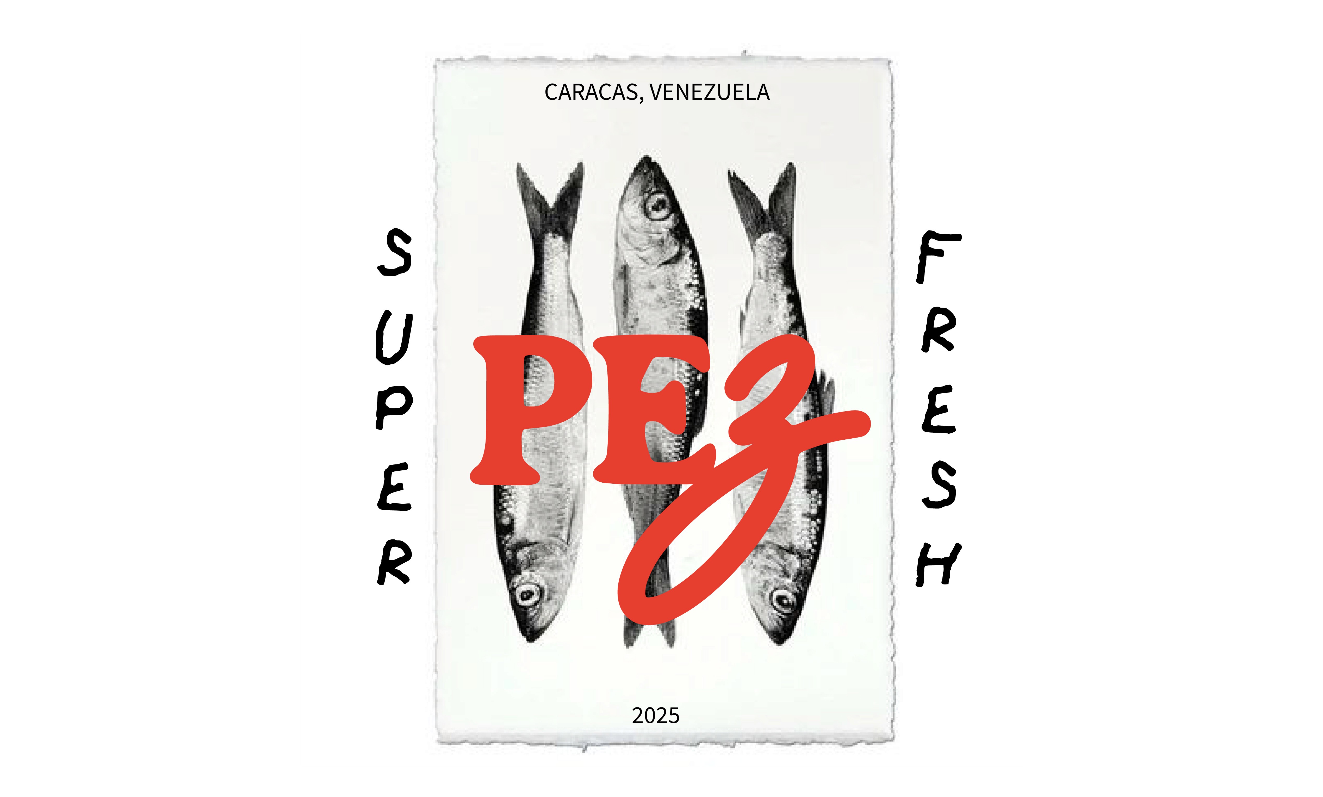
PEZ is a sushi delivery brand that sought a fresh identity to connect with a younger audience—without losing its sense of sophistication. The result: a visual system that blends emotional typography, editorial atmosphere, and a color palette that celebrates freshness while avoiding clichés.
Client:
The Wave x PEZ.ccs
My Role:
Graphic Designer
Year:
2025
Service Provided:
Graphic Design & Community Managment


This rebranding began with a clear premise: premium doesn’t have to mean distant. Through an art direction that mixes earthy tones, red accents, and playful compositions, the visual identity was crafted to feel contemporary and design-conscious, while staying rooted in product quality.
The typographic system—THECRAYONMASTER paired with a variable serif—creates strategic duality: emotional warmth and editorial clarity. Each element plays a defined role: the logo as anchor, typography as voice, colors as atmosphere, icons as accent.
The layout breaks away from the typical “minimalist blue sushi” aesthetic. Instead, it proposes a warmer, more memorable visual language. Grayscale images and neutral backgrounds (green, beige, white) act as visual breathing spaces, allowing the dishes to stand out without competing. Polaroid-style frames in the lower left corner introduce an editorial touch that hints at storytelling and nostalgia.
PEZ emerges as a brand that’s young, urban, and unafraid to challenge convention. From the red lettering to the three-fish icon, every design choice communicates freshness, dynamism, and effortless sophistication.
